Mobile-First Design Approach
Designing digital products with mobile users as the primary focus.

In today’s digital world, mobile devices have become the primary way people access websites, applications, and online services. From shopping and banking to communication and entertainment, users rely heavily on smartphones for their daily activities. As a result, businesses and designers must prioritize mobile experiences to meet modern user expectations. This shift in user behavior has led to the rise of the mobile-first design approach, a strategy that focuses on designing digital products for smaller screens before adapting them for larger devices such as tablets and desktops.
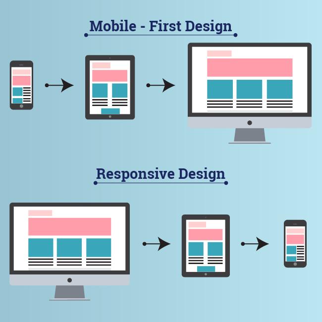
A mobile-first design approach is more than simply making a website responsive. It is a mindset that places mobile usability, performance, and accessibility at the center of the design process. Instead of creating a desktop version first and then trying to shrink it for mobile screens, designers begin with the smallest screen and gradually expand the experience for larger devices. This ensures that the core functionality and user experience remain effective regardless of the device being used.
One of the main reasons mobile-first design has become essential is the increasing number of mobile internet users worldwide. Studies consistently show that a large percentage of global web traffic now comes from smartphones. Users expect websites and applications to load quickly, function smoothly, and provide a seamless experience on mobile devices. If a platform fails to meet these expectations, users are more likely to leave and switch to a competitor. Businesses that ignore mobile optimization risk losing potential customers, reducing engagement, and damaging their brand reputation.
A mobile-first strategy encourages simplicity and clarity in design. Since mobile screens have limited space, designers must focus only on the most important content and features. This naturally leads to cleaner layouts, better content hierarchy, and more intuitive navigation. By removing unnecessary elements and prioritizing essential actions, businesses can create user experiences that are faster, more efficient, and easier to understand.
Performance optimization is another major advantage of mobile-first design. Mobile users often access digital platforms while traveling or using slower internet connections. Heavy images, unnecessary animations, and complex layouts can negatively impact loading speed and usability. Mobile-first development forces teams to optimize assets, reduce unnecessary code, and improve overall performance from the beginning of the project. Faster websites not only improve user satisfaction but also contribute to better search engine rankings and higher conversion rates.
Responsive design plays a critical role in the mobile-first approach. A responsive website automatically adjusts its layout and elements according to the screen size and device type. However, mobile-first responsive design starts with the smallest screen and progressively enhances the experience for larger screens. This approach ensures that mobile users receive a fully functional and optimized experience rather than a simplified or compromised version of the desktop design. 
Navigation design is especially important in mobile-first experiences. Desktop websites often rely on large menus, multiple navigation bars, and complex page structures. On mobile devices, these elements can become overwhelming and difficult to use. Mobile-first design promotes simplified navigation patterns such as hamburger menus, bottom navigation bars, and clear call-to-action buttons. These patterns improve usability and allow users to quickly access important sections without confusion.
Typography and readability are also essential considerations in mobile-first design. Text must remain clear and readable on smaller screens without requiring users to zoom in or scroll excessively. Designers often use larger font sizes, proper spacing, and short content sections to improve readability. Well-structured typography enhances user comfort and ensures that important information is communicated effectively.
Touch interaction is another factor that distinguishes mobile-first design from traditional desktop-focused approaches. Mobile users interact with interfaces using their fingers instead of a mouse cursor. Buttons, links, and interactive elements must therefore be large enough to tap comfortably without accidental clicks. Designers must also consider gestures such as swiping, scrolling, and pinching when creating mobile interfaces. Optimizing for touch interactions improves accessibility and creates a smoother user experience.
The mobile-first approach also supports better accessibility standards. Many users access digital platforms under varying conditions, including bright sunlight, limited connectivity, or physical limitations. Designing for mobile encourages teams to focus on clear layouts, high contrast, readable fonts, and simple interactions. These improvements benefit all users and contribute to a more inclusive digital experience.
Search engine optimization is another important reason businesses adopt mobile-first design. Search engines like Google prioritize mobile-friendly websites in their rankings through mobile-first indexing. This means that the mobile version of a website is considered the primary version for ranking and indexing purposes. Websites that provide poor mobile experiences may experience lower visibility in search results, reducing traffic and business opportunities. By implementing a mobile-first strategy, businesses can improve both usability and SEO performance.
E-commerce platforms especially benefit from mobile-first design. Modern consumers frequently browse products, compare prices, and complete purchases directly from their smartphones. A poorly optimized mobile shopping experience can lead to abandoned carts and lost revenue. Mobile-first e-commerce design focuses on simplified product pages, fast checkout processes, optimized payment flows, and clear product images. These improvements increase customer trust and improve conversion rates.
Social media platforms have also influenced the popularity of mobile-first experiences. Most social media engagement occurs on mobile devices, and users often discover brands through platforms such as Instagram, TikTok, Facebook, and LinkedIn. When users click on a link from social media, they expect the destination page to load quickly and function perfectly on their phones. Businesses that fail to provide smooth mobile experiences may lose valuable marketing opportunities and customer engagement.
From a development perspective, mobile-first design encourages better coding practices and scalable architecture. Developers build lightweight interfaces and gradually add advanced features for larger devices. This approach often results in cleaner code, improved maintainability, and better long-term scalability. Progressive enhancement ensures that all users can access core functionality, even if their devices or browsers have limitations.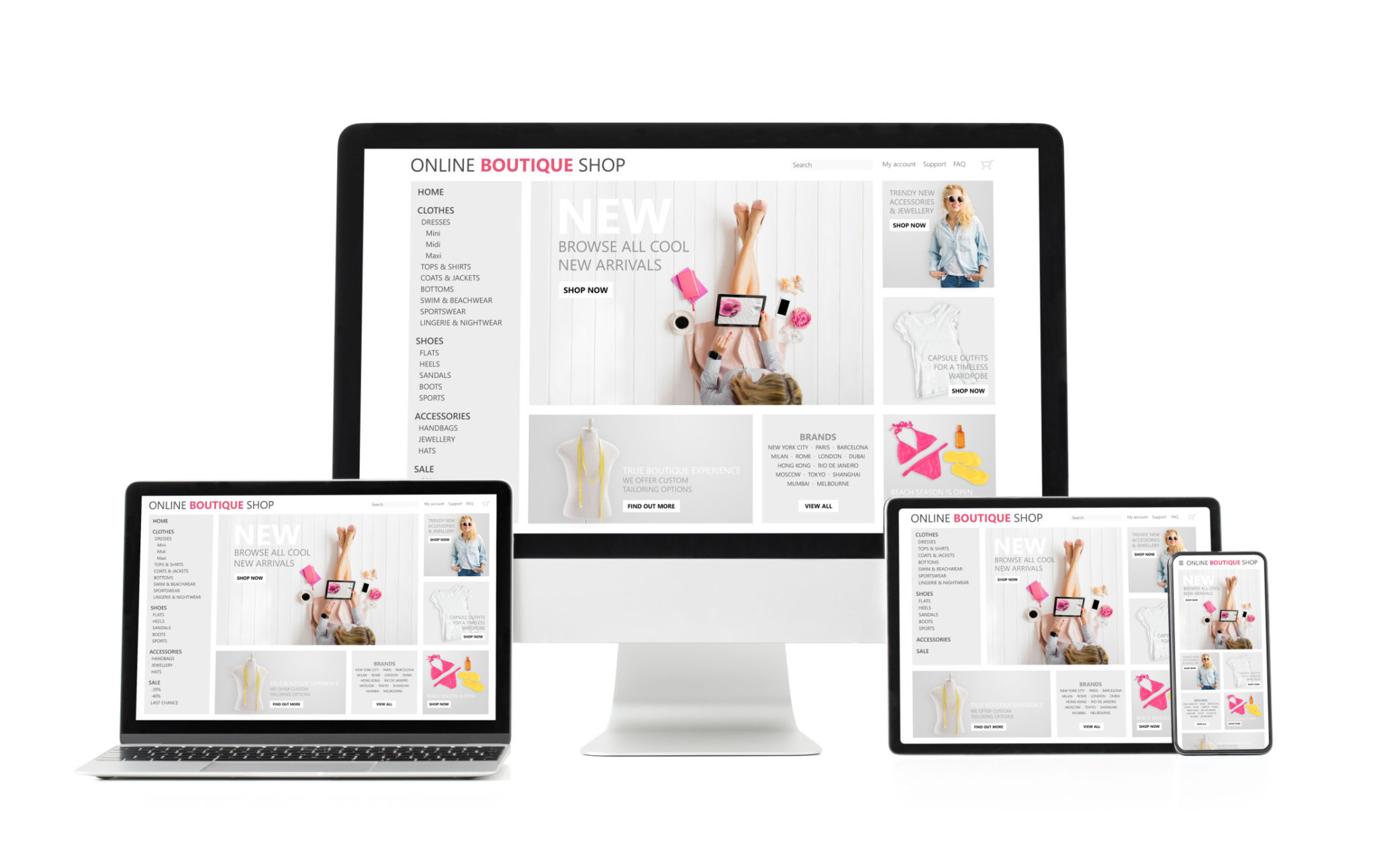
Testing is another critical part of the mobile-first process. Designers and developers must test applications across multiple screen sizes, operating systems, and device types to ensure consistency and performance. Real-device testing helps identify usability issues, broken layouts, and performance problems that may not appear during desktop testing alone. Continuous testing and optimization are essential for maintaining a high-quality user experience.
Many successful global companies have embraced mobile-first design as a core strategy. Platforms such as Airbnb, Uber, Instagram, and Amazon prioritize mobile usability because they understand the importance of delivering seamless experiences to users on the go. Their interfaces are designed to minimize friction, simplify user journeys, and encourage fast interactions. These companies demonstrate how mobile-first thinking can drive customer satisfaction and business growth.
As technology continues to evolve, the importance of mobile-first design will only increase. Emerging technologies such as foldable devices, wearable technology, and progressive web applications are reshaping how users interact with digital products. Businesses that adopt mobile-first principles today will be better prepared to adapt to future innovations and changing user expectations.
In conclusion, the mobile-first design approach is no longer just a trend—it is a necessity in the modern digital landscape. By prioritizing mobile users, businesses can create faster, more accessible, and more engaging experiences that meet the needs of today’s audience. Mobile-first design improves usability, performance, search visibility, and customer satisfaction while supporting long-term scalability and innovation. Organizations that embrace this approach position themselves for success in an increasingly mobile-driven world.
Related Insights








Your next great product decision starts with one conversation.
If your product isn't where you want it to be, 30 minutes with us might tell you why.And more often than not, we're exactly the team to fix it.
Book a Free Discovery Call


